Course Description
ARTD 222 Typographic Practice is an introductory studio course that serves as a comprehensive survey of typographic practices across various media platforms. The course is structured around a series of lectures, readings, projects, class discussions, and critiques, all aimed at developing students’ understanding and skills in building effective typographic systems for visual communication.
Course Objectives
Typography and Narrative: Students will learn to identify and analyze various typefaces and the nuances of specific letterforms, understanding how typography can shape the narrative and aesthetics of visual communication.
Typographic Language and Critique: Develop a comprehensive understanding of the language of typography, encompassing terminology, type anatomy, critical theory, history, and technology, and apply this knowledge through critique and craftsmanship.
Systematic Design and Hierarchies: Demonstrate the ability to create and manipulate typographic hierarchies and relationships within a grid system using a systematic approach to typographic problem-solving.
Role of Typography in Communication: Recognize and evaluate the impact of typography in design, exploring its potential to enhance clarity, visual appeal, and overall communication effectiveness.
Key Projects
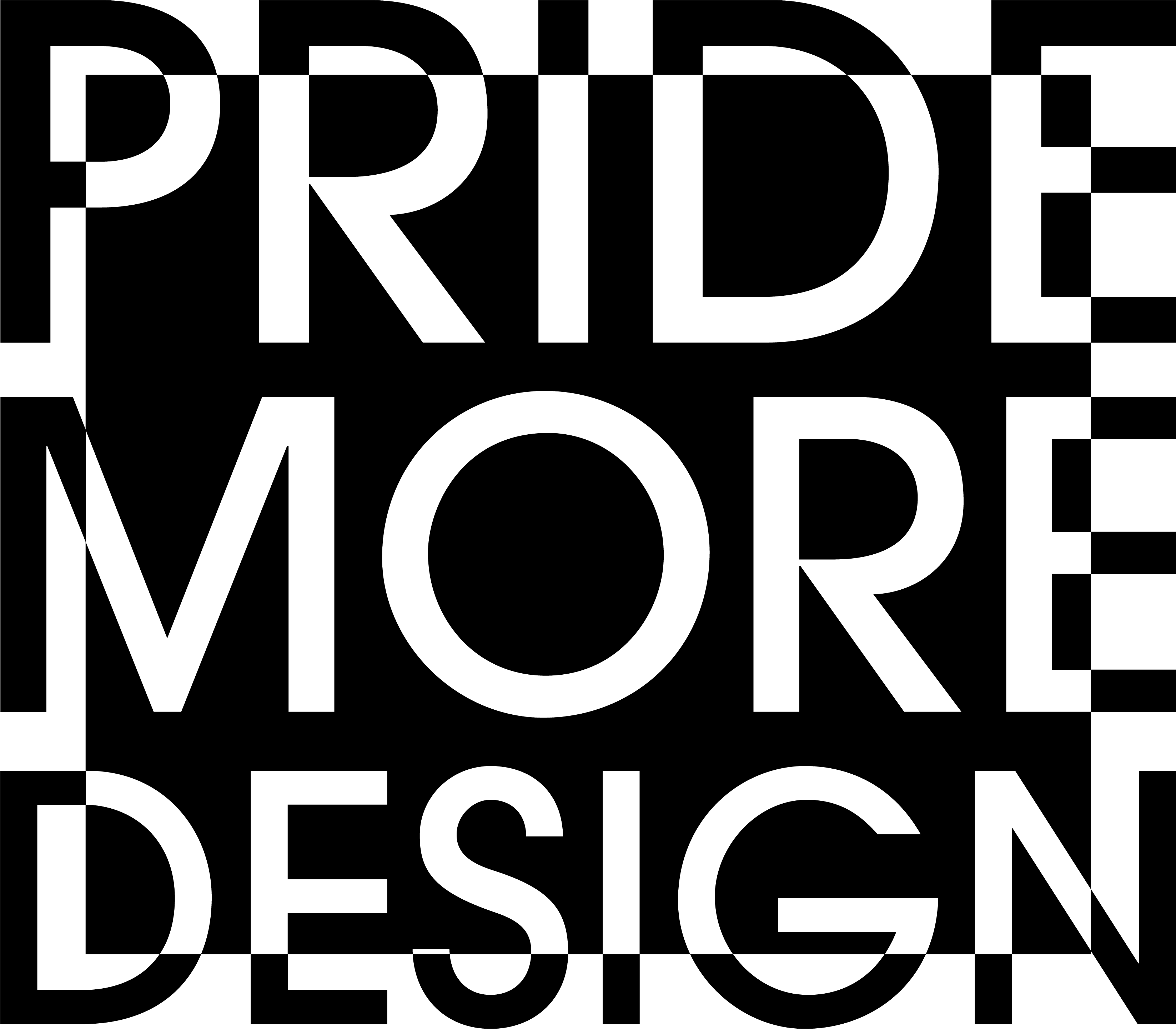
Essay and Poster: Students read a critical essay on typography and write a reflective summary. They then design a poster that encapsulates the essence of the essay using symbols, letters, or words, but no images.
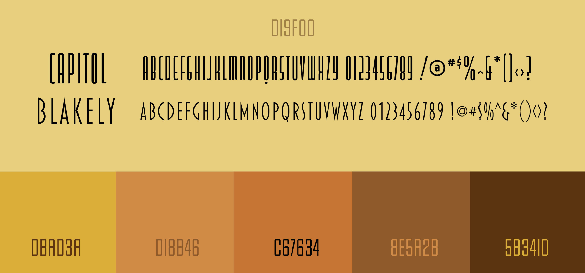
Type Specimen Book: Students create an 8-page book that showcases a chosen typeface family, informed by research into the designer and relevant societal and cultural contexts.
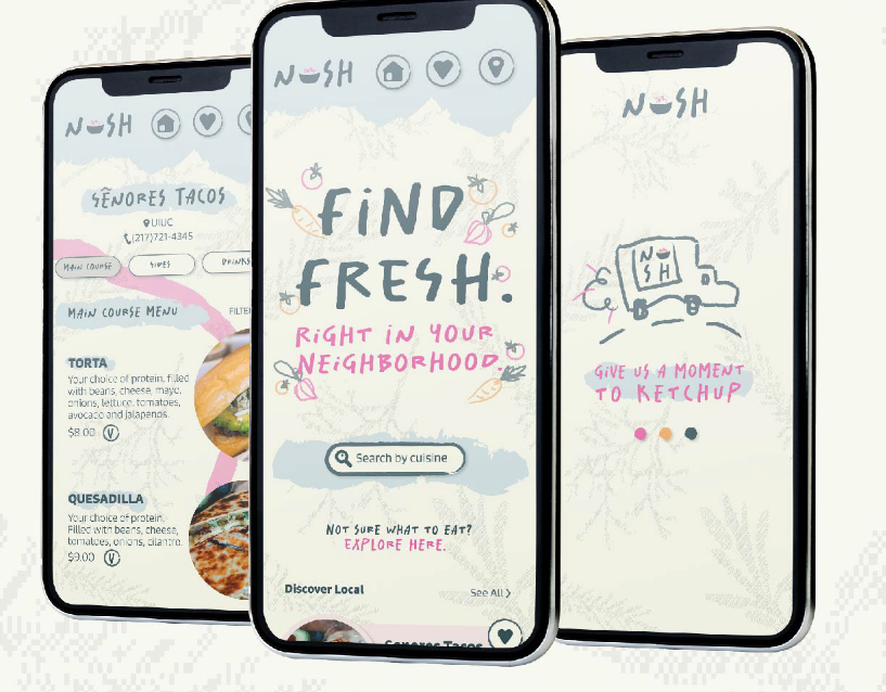
Custom Display Type and Poster: Students develop a display type inspired by a city, designing a type-centric poster to showcase this type.
Branding and Packaging: Students develop a brand and create typographic product packaging, featuring typographic patterns. followed by designing an Instagram ad to promote their brand.
Teaching Methods
The course combines theoretical learning with practical assignments to ensure that students not only learn about the fundamentals of typography but also apply their knowledge in creating meaningful and communicative design works. This blend of theory and practice prepares students for professional roles in graphic design, focusing on typography's impact on effective communication.
Student Visual Identity + Packaging Samples
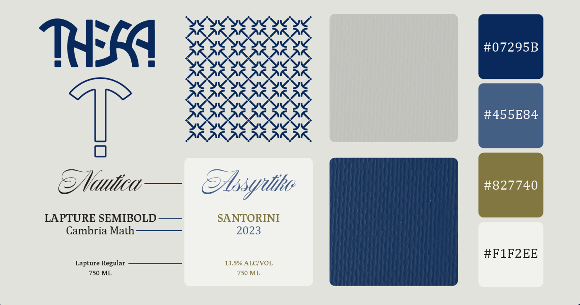
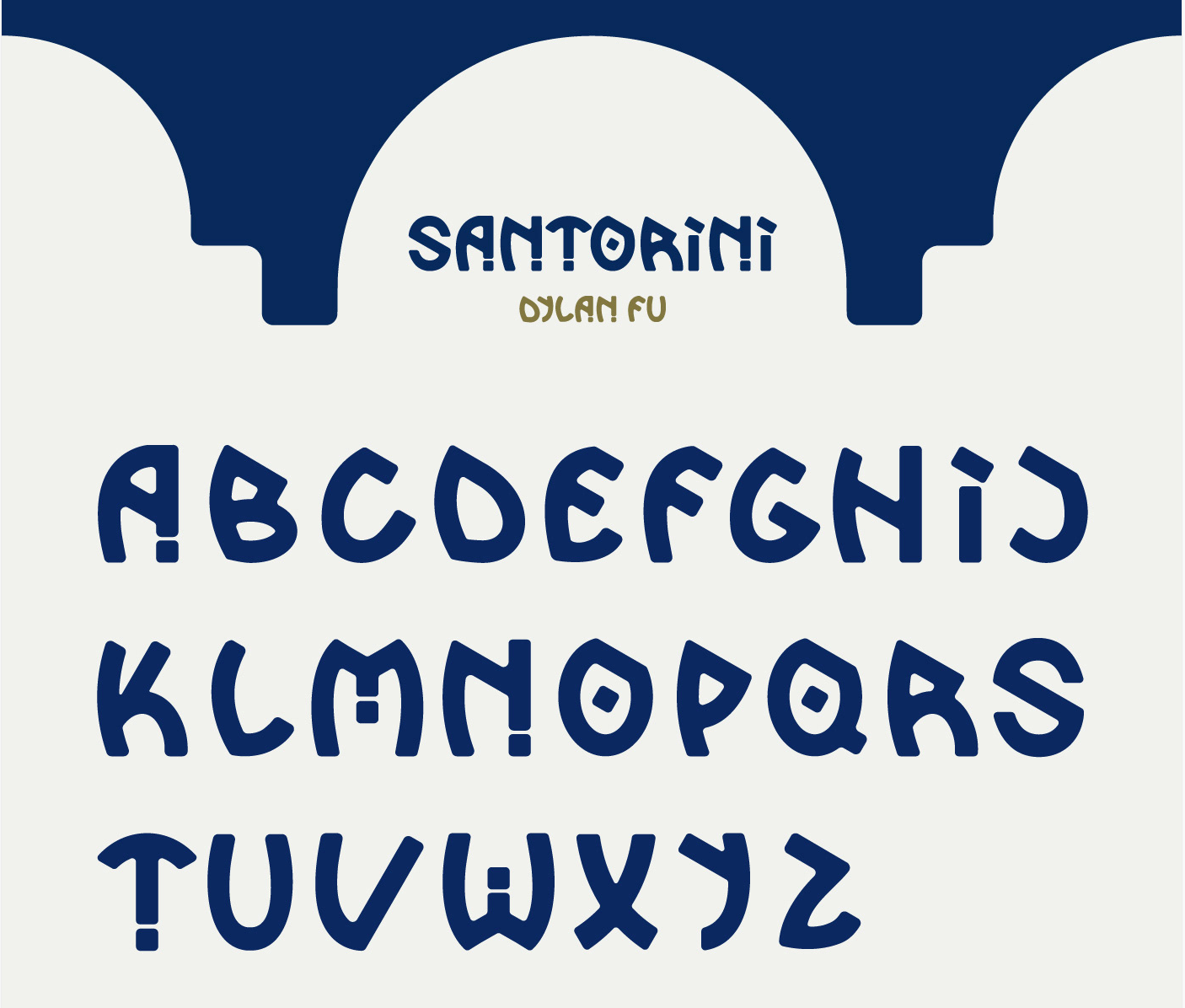
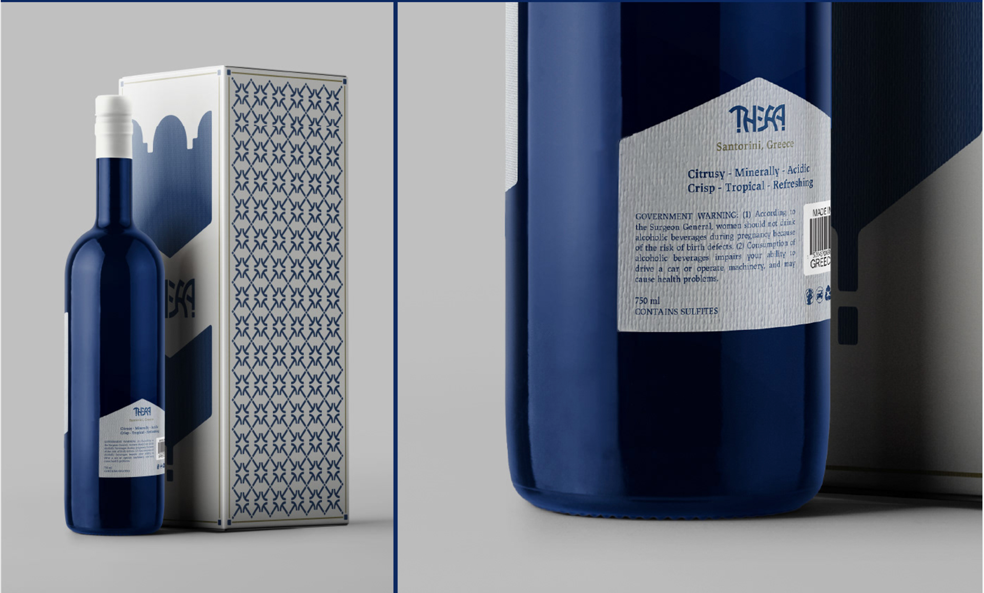
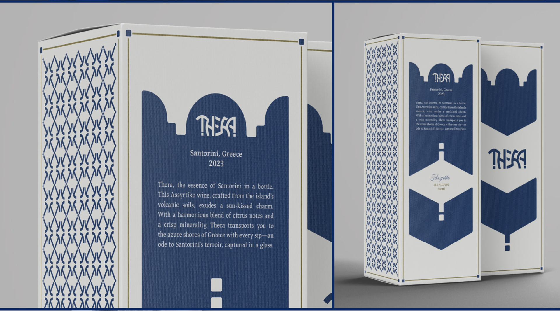
By Dylan Fu: Luxurious, Exclusive, Regional, and Distinct
Thera, the essence of Santorini in a bottle. Santorini is a typeface designed for Thera that captures the Greek island's essence, inspired by the Cycladic architecture to its volcanic landscape.
The packaging features colors seen in the idyllic destination and a typographic pattern using the T in the logo.
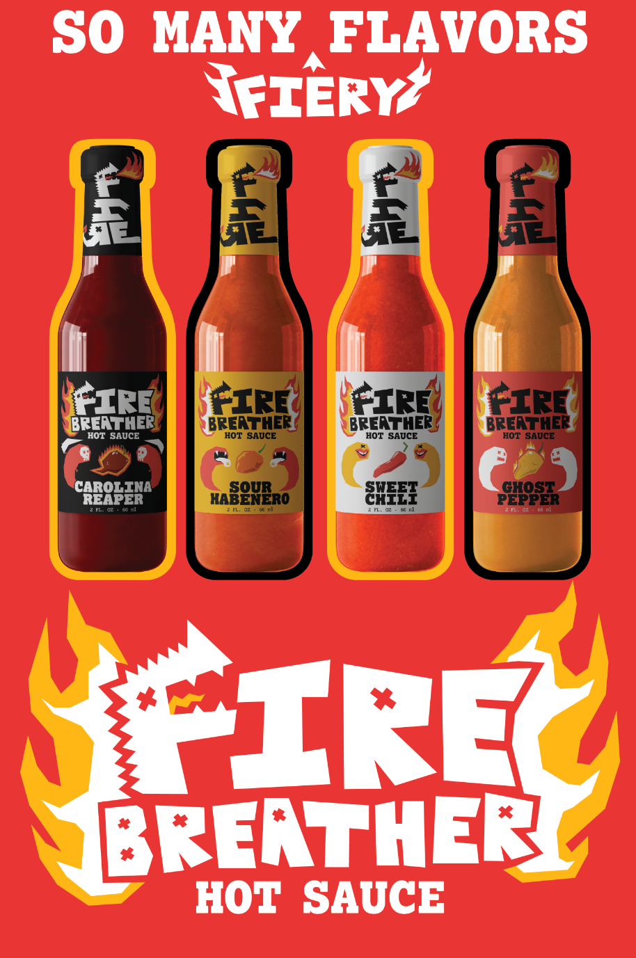
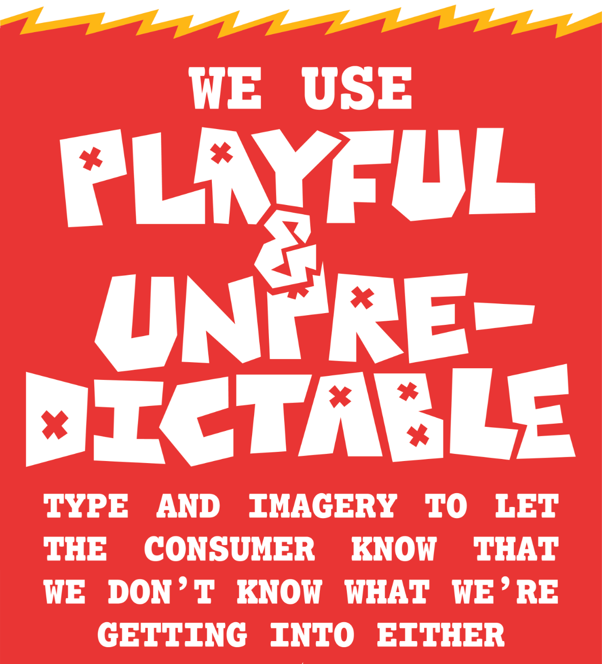
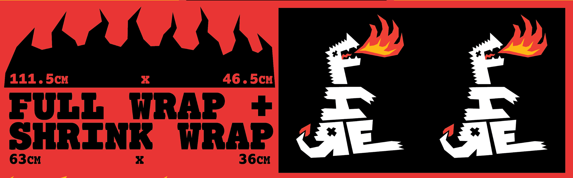
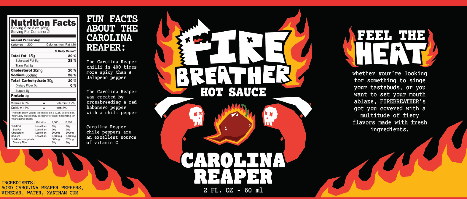
By Ben Tairy: Playful, Fiery, and Dynamic
At Firebreather, we don't just want to push you to your limits, we want to show everyone that they can handle the heat.
The branding reflects intensity while not stooping to anger and keeping some brevity and whimsy. We want to show people that spice is for everyone and that although it is a painful experience there is desirability in hot sauce.

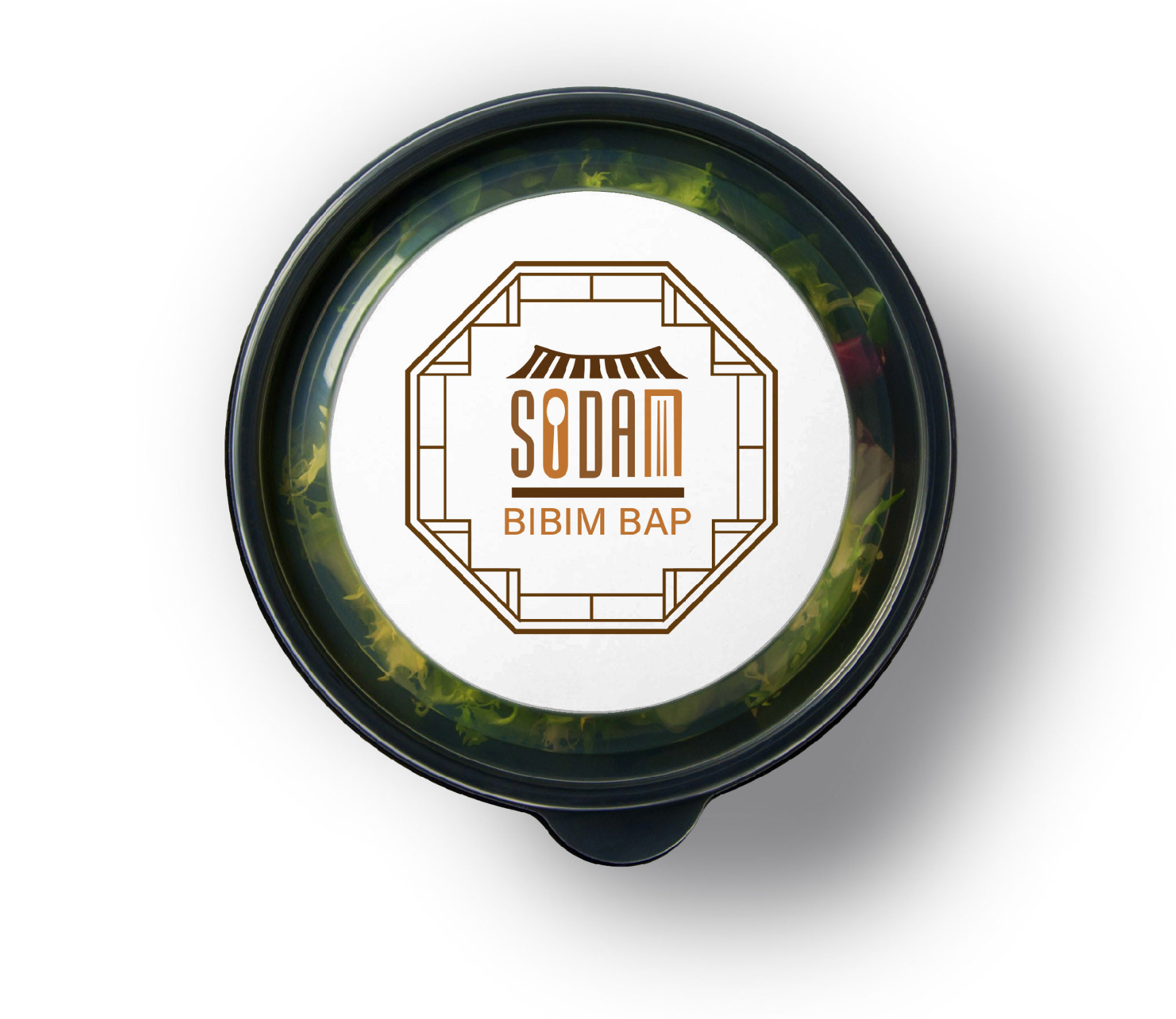
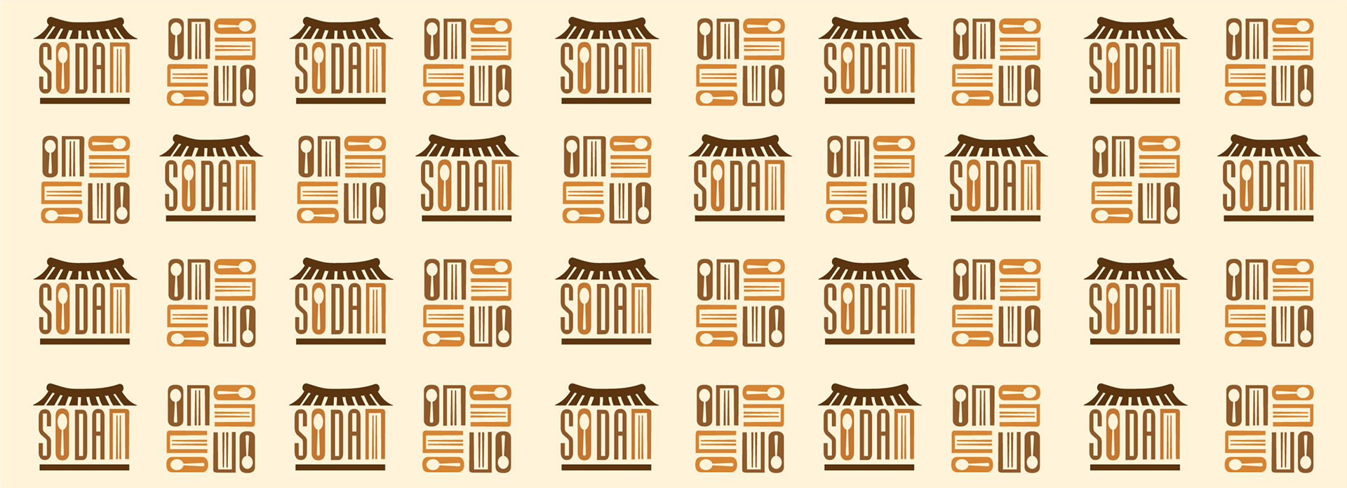
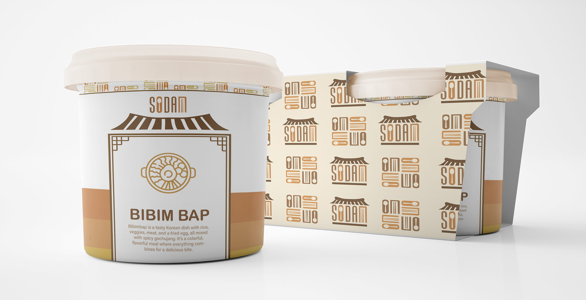
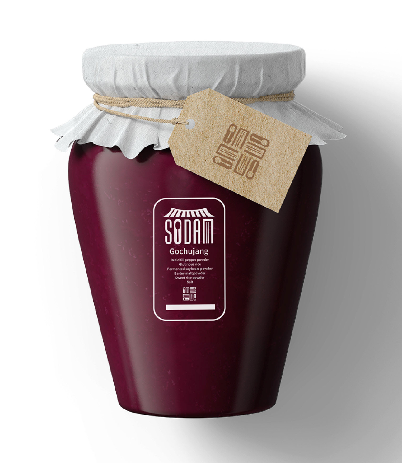
By Hyo-In Won: Sodam means “looks delicious” in Korean
Sodam is a brand dedicated to introducing Korean traditional and fusion cuisine to individuals seeking accessible and approachable experiences with Korean culinary offerings.
The visual identity is inspired by the architectural aesthetics of traditional Korean houses. This can be seen in the logo's stylized rendition of a traditional roof, complemented by the inclusion of typographic spoons and chopsticks.

Additional Student Samples