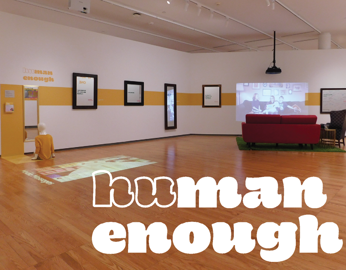
Many is an outreach effort for parents of young children who wish to be a source of support in their child's journey of self-discovery. Challenge your own expectations of how men and women should act, and model the behaviors you want to encourage. Many promotes the pillars of healthy gender expression: speaking up, talking openly, being vulnerable, personal expression, and consent.
The identity was based on the idea of the many colors of manhood. The figure-ground relationship of the colors became a simple visual tool that is used to emphasize "man" in "many."
WEBSITE
PROBLEM:
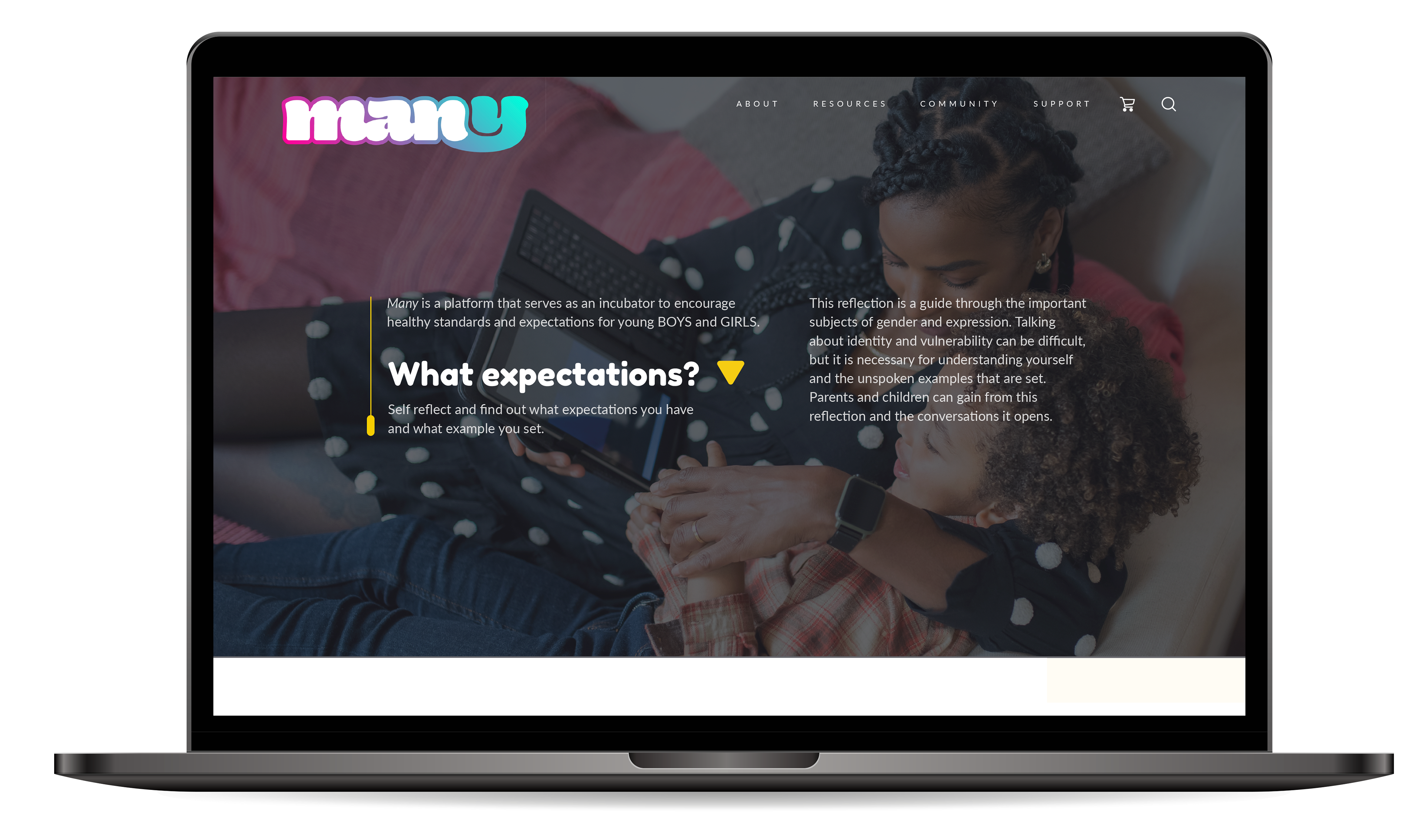
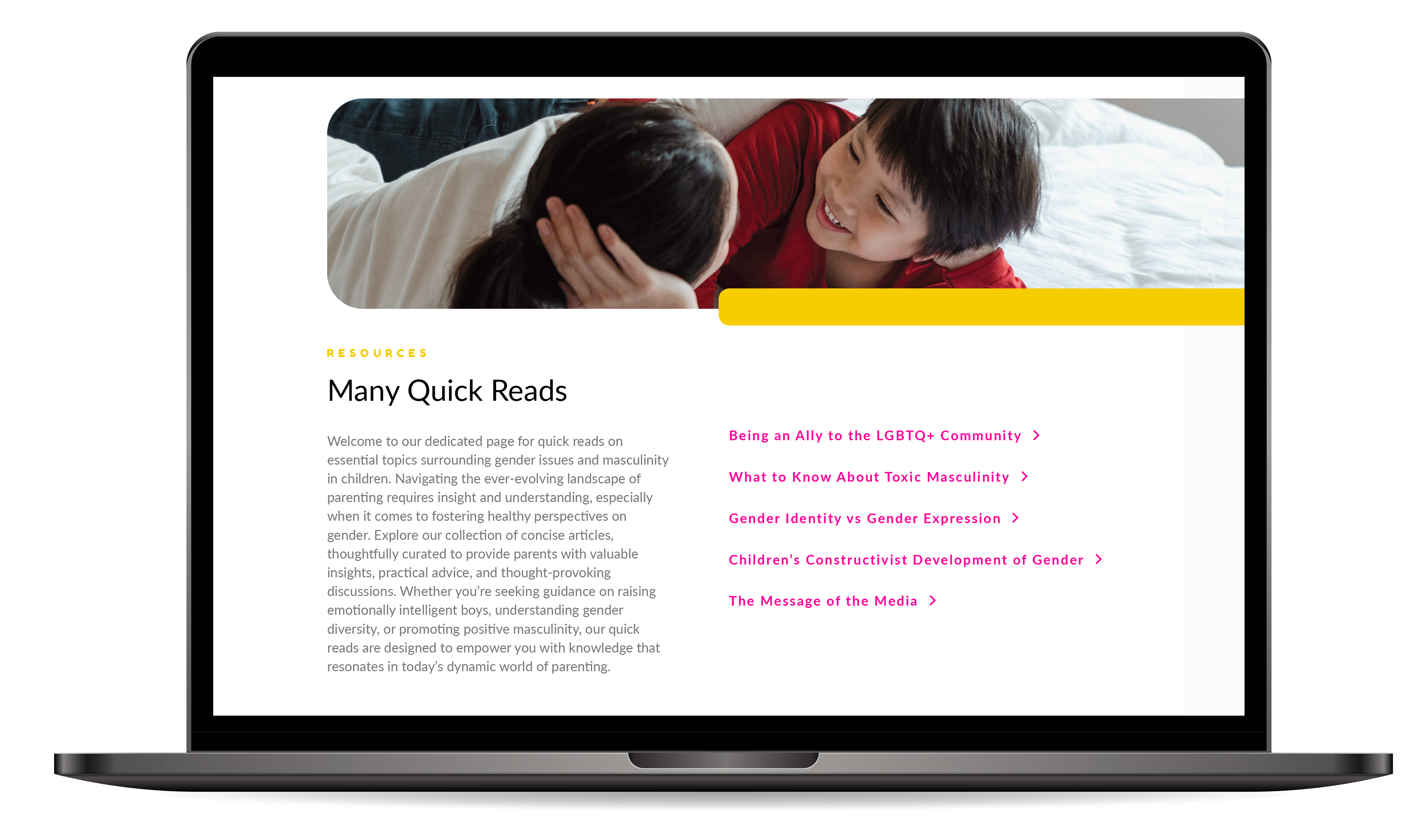
Many, a media literacy and gender expression education platform, needed a digital presence that reflected its mission of fostering empathy and understanding in families. The challenge was to create a website that not only provided resources and tools for parents and guardians but also engaged guardians in a meaningful way to encourage healthy conversations about gender expression.
SOLUTION:
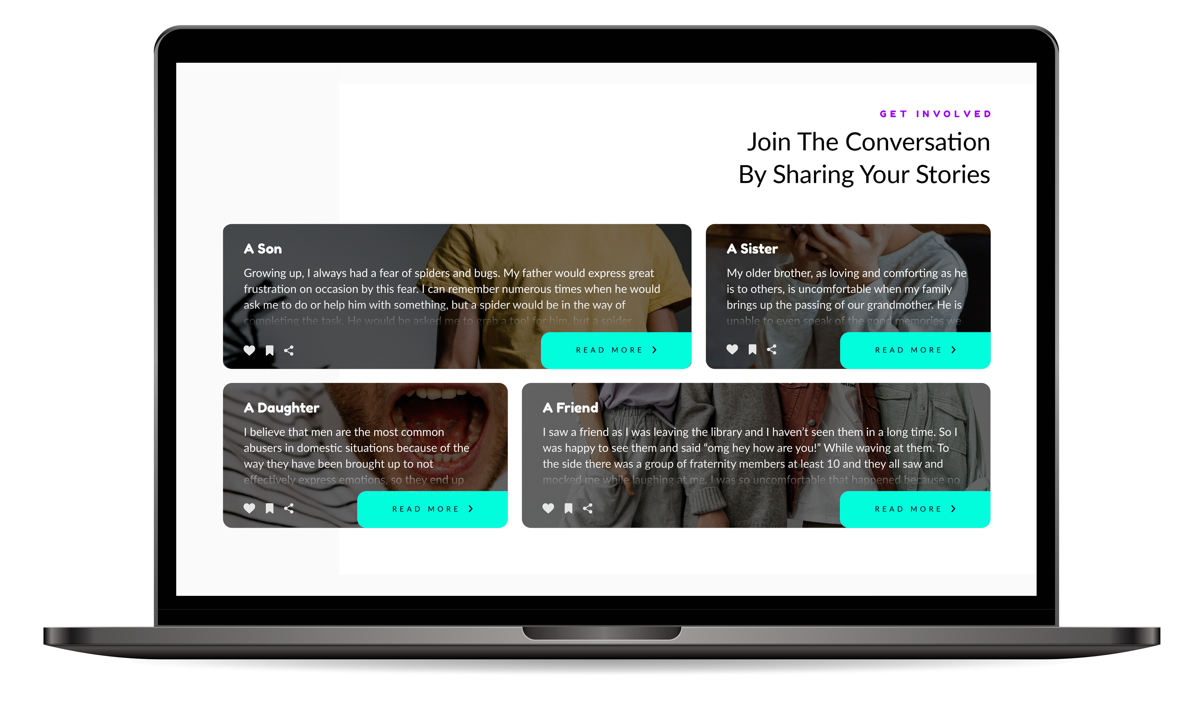
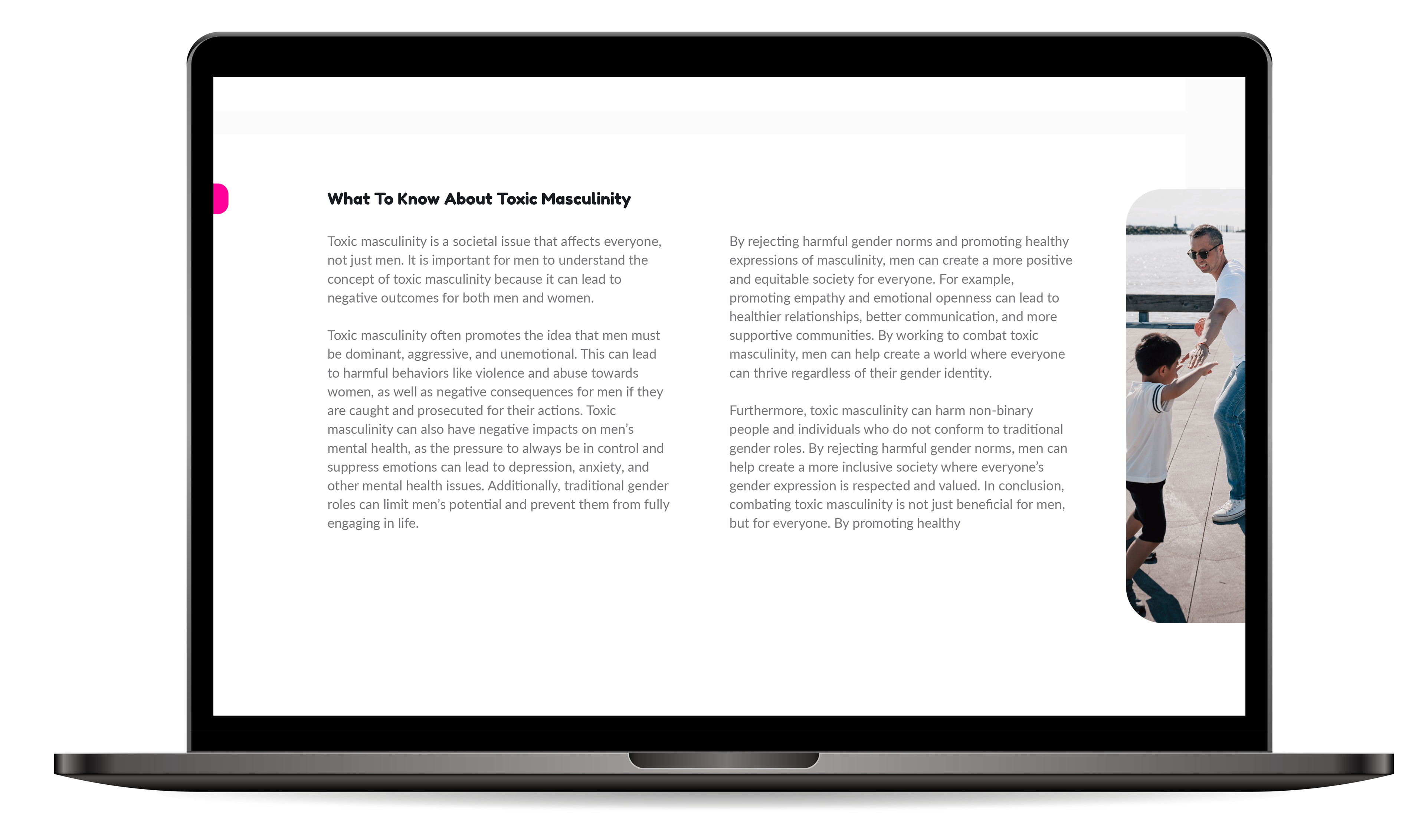
This website design for MANY serves as a hub for educational resources and tools. I focused on creating a user-friendly interface with interactive elements to engage children. The design incorporated bright colors and playful graphics to appeal to a younger audience while maintaining a professional look to appeal to adults. I also implemented a personal introspection guide feature that allows guardians to explore their own identity and self-expression as a mirror of the similar children's guide book sold on the website, fostering open communication and understanding.
KEY FEATURES:
— Interactive tools for users to explore experiences with gender expression
— Educational resources for parents and guardians
— Conversational guide for family discussions
— Playful and engaging design
— Integration with social media for wider reach



IMPACT:
The Many website has received positive feedback from users, with families appreciating the resources and tools available. The conversational guide feature has been particularly well-received, helping families navigate important discussions about gender identity and expression. Overall, the website has successfully promoted empathy and understanding in families, aligning with Many's mission.
SOCIAL MEDIA
PROBLEM:
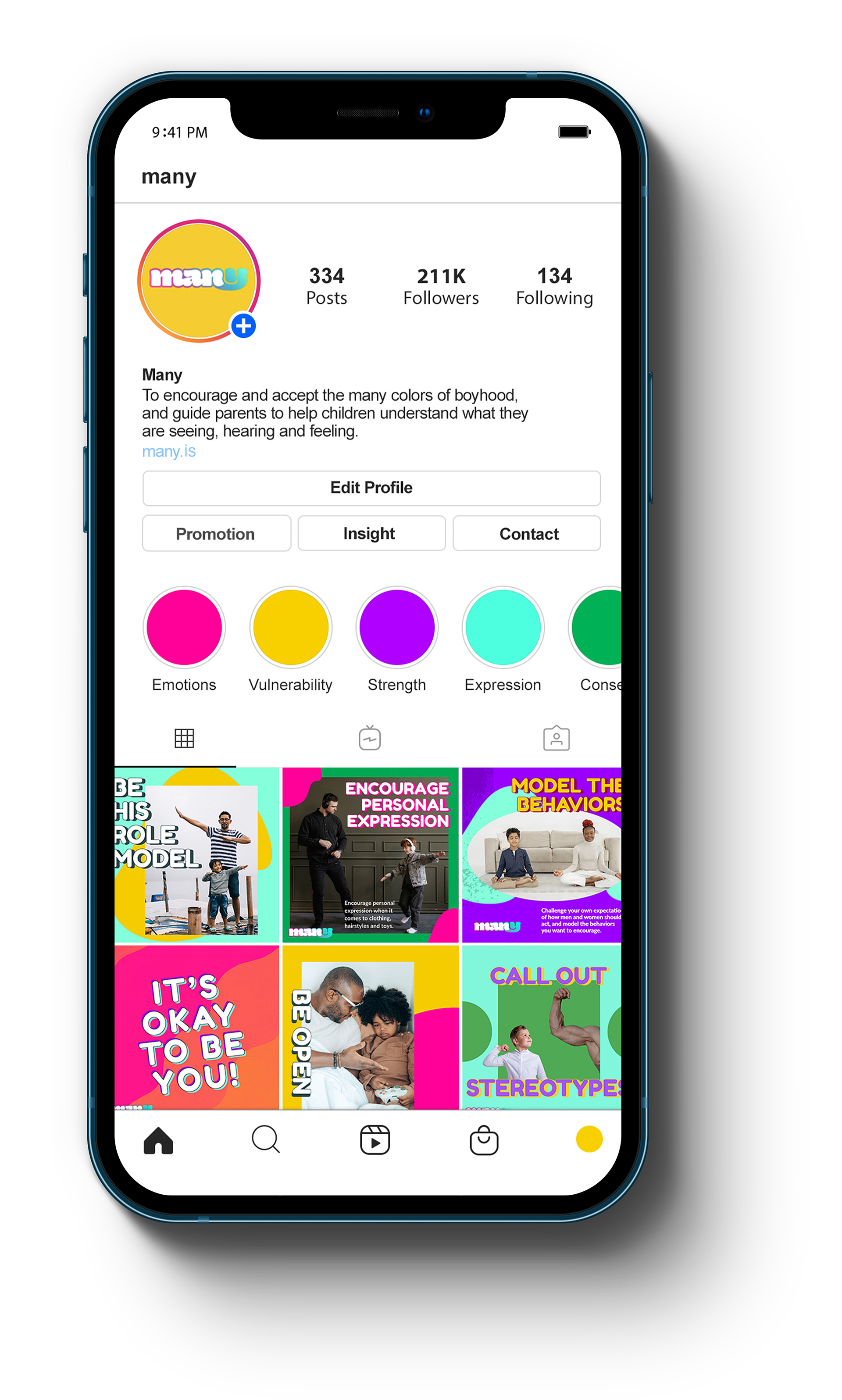
Many needed a social media presence that would effectively reach and engage its target audience of parents, guardians, and caregivers. The challenge was to create social media profiles that reflected MANY's mission of promoting empathy and understanding in families while maintaining a consistent brand identity across platforms.
SOLUTION:
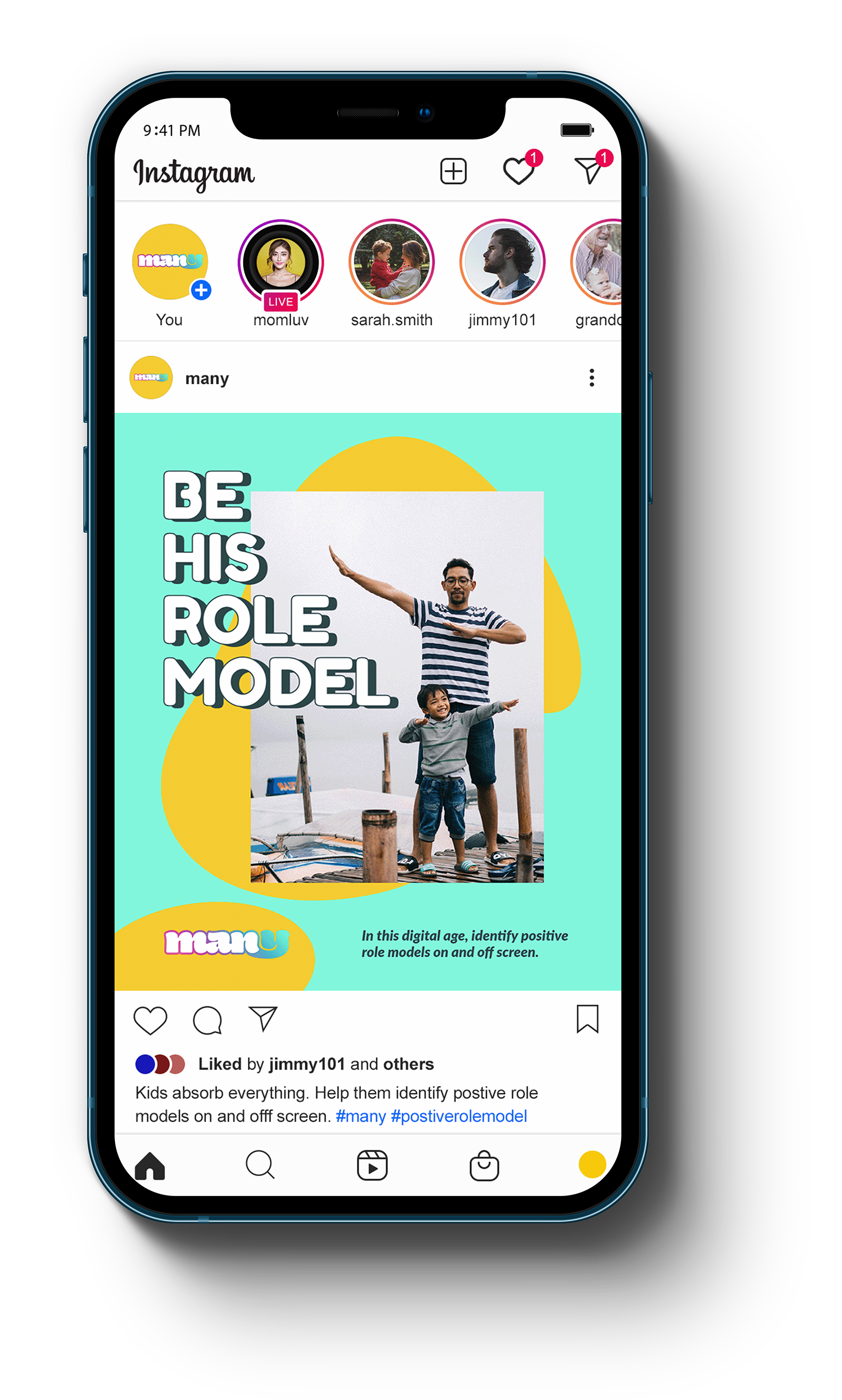
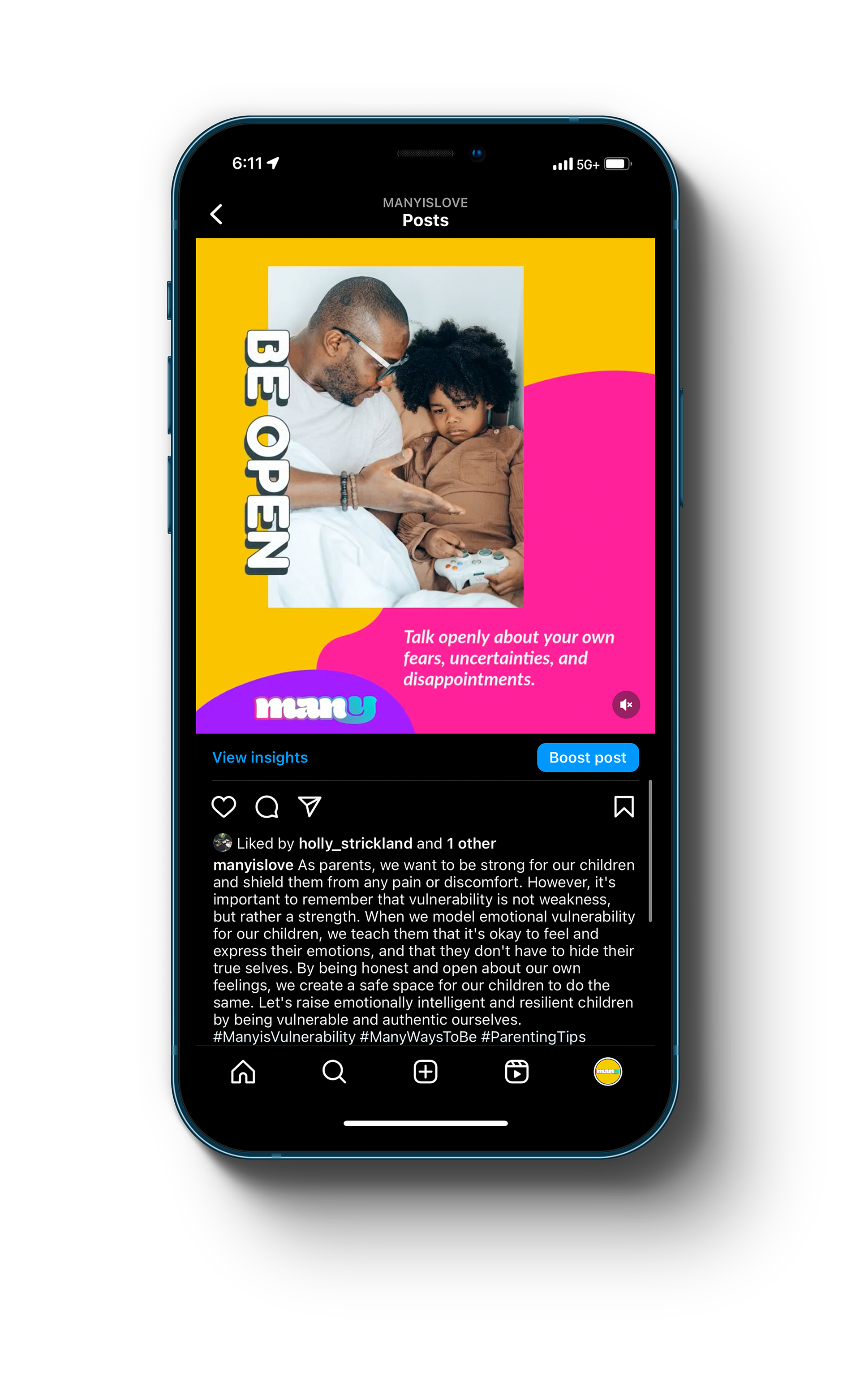
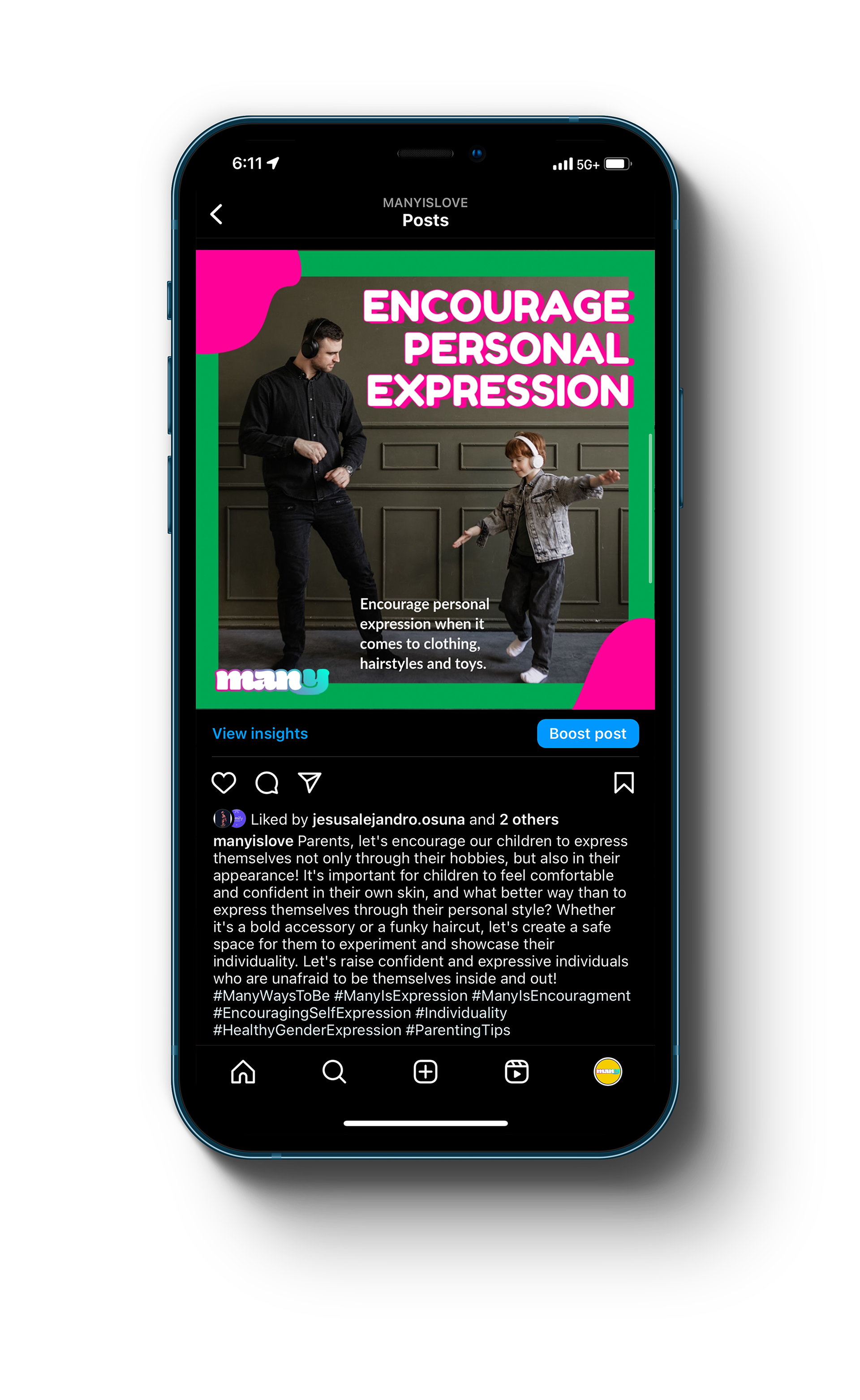
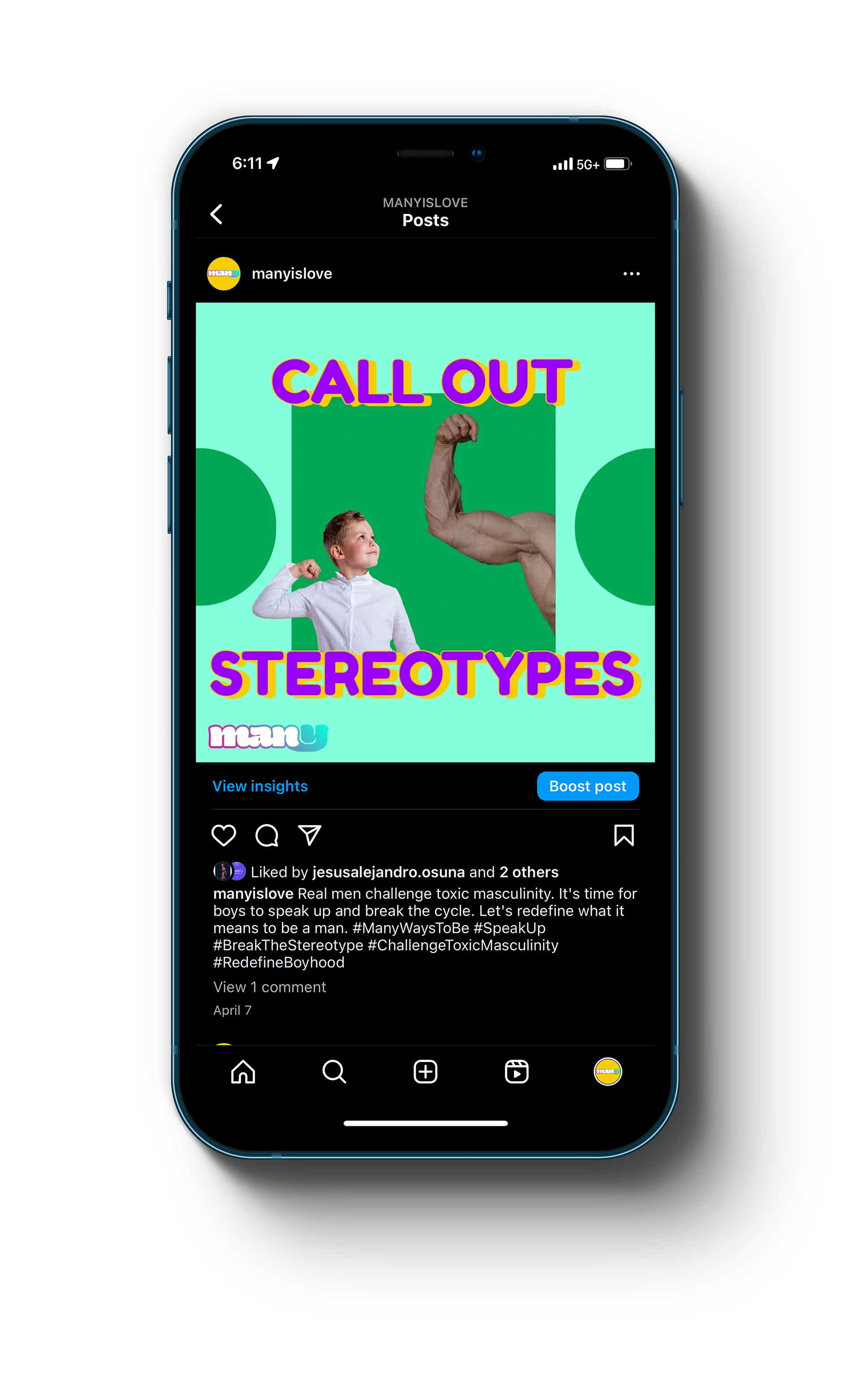
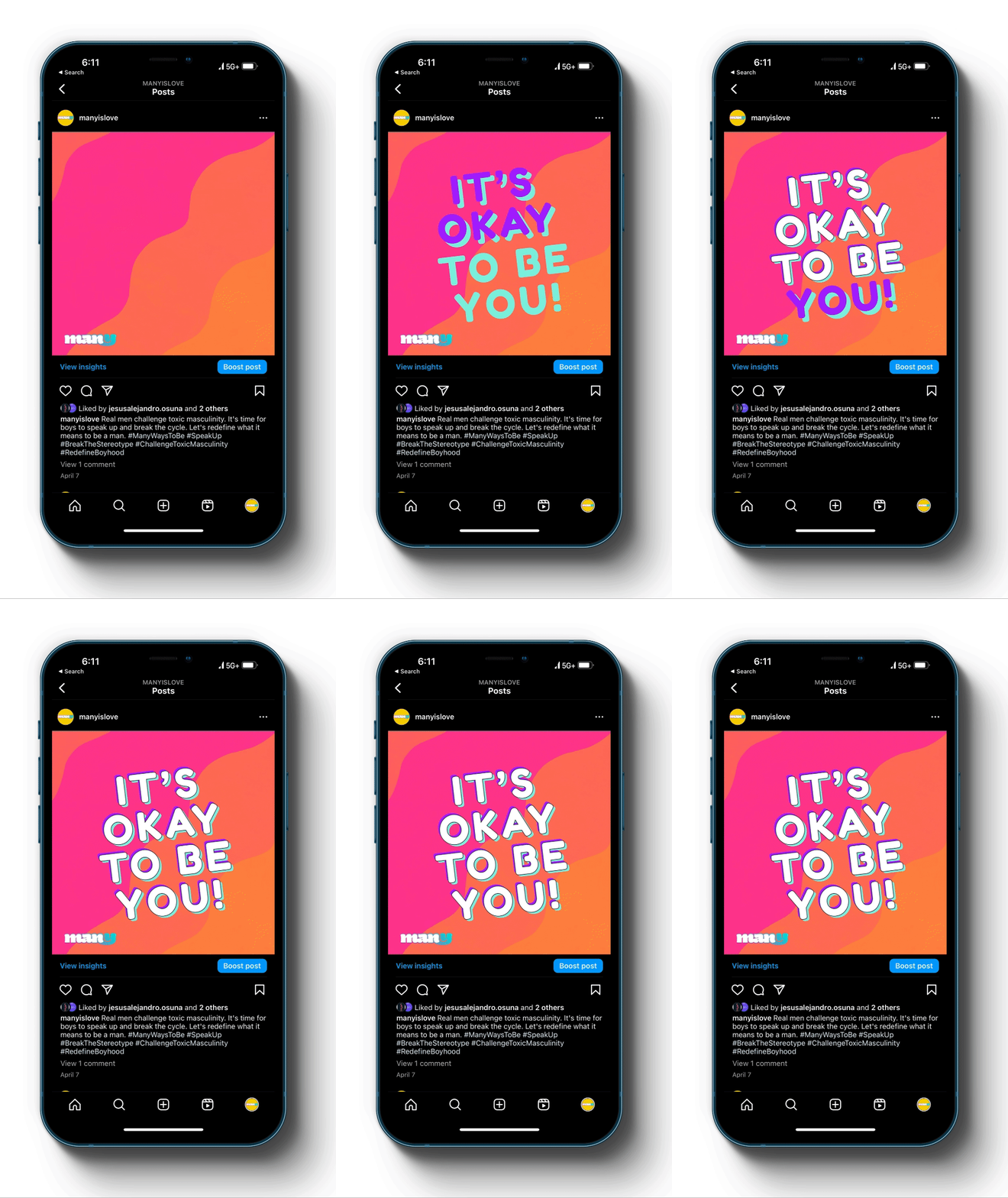
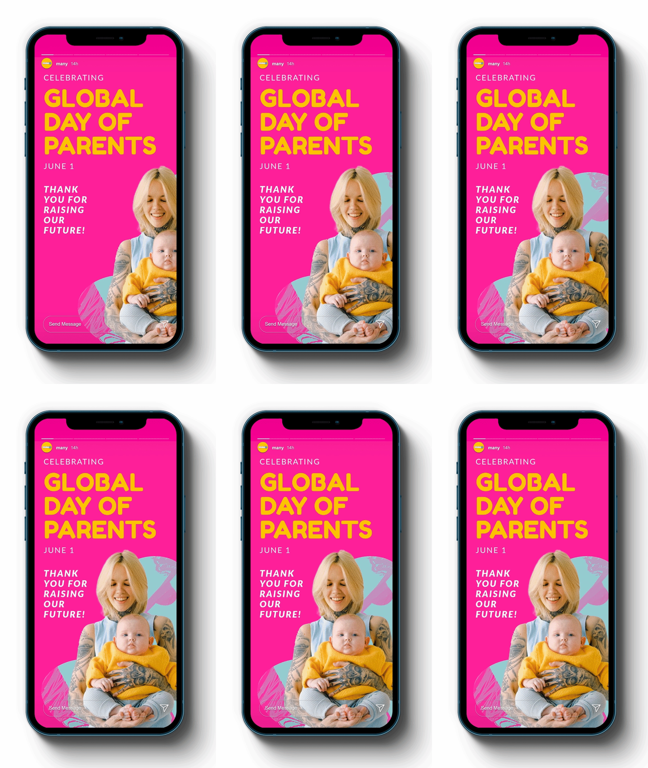
Our team developed social media profiles for MANY that combined informative content with engaging visuals. We created a content strategy that included educational posts, inspirational quotes, and interactive challenges to encourage meaningful interactions with followers. The design of the profiles was cohesive, using the same color palette and imagery as the website to create a seamless brand experience. We also integrated the profiles with the website to drive traffic and increase engagement.
KEY FEATURES:
— Educational content on gender identity and expression
— Inspirational quotes and stories
— Interactive challenges and activities
— Consistent brand identity across platforms
— Integration with website for seamless user experience

IMPACT:
The social media profiles have helped Many increase its reach and engagement with its target audience. The informative and engaging content has attracted new followers and sparked important conversations about gender identity and expression. The integration with the website has also helped drive traffic and increase awareness of Many's mission, ultimately promoting empathy and understanding in families.
BRAND
PROBLEM:
Many needed a distinctive logo and brand identity that would resonate with its target audience of parents, guardians, and caregivers. The challenge was to create a brand that would convey the values of empathy, inclusivity, and understanding, while also being memorable and visually appealing.
SOLUTION:
I developed a logo and brand identity for Many that captured the essence of the brand. The logo features the stylized "man" in "many" that represents the diverse and inclusive nature of the brand. The color palette includes dynamic, inviting colors that evoke a sense of familiarity, comfort and safety. The brand typography is modern and approachable, reflecting Many's mission of promoting empathy and understanding in families.
KEY FEATURES:
— Distinctive and memorable logo design
— Dynamic and inviting color palette
— Modern and approachable typography
— Brand guidelines for consistent use across platforms
IMPACT:
The logo and brand identity have helped Many establish a strong and recognizable brand presence. The logo is easily identifiable and conveys the brand's message of empathy and inclusivity. It also makes for a fun sticker!
